Conference presentations are important in every profession majorly for those which are related to academics. In most of the projects requires condensing a much longer paper into a 15 to 20 minute presentation which becomes challenging. However, presenting the work is an important academic and professional exercise because it allows sharing research, ideas and arguments with a wider audience. Presentations include visual elements (e.g. Power Point), which is used for converting a written paper into a visual material that is appropriate for the topic.
How the presentation must be prepared?
Firstly, a written note of 5-6 pages of the complete work must be prepared to incorporate only the major points of the project. This note must clearly and equally divide the introduction, thesis, the main points of evidence and the conclusion to avoid losing track on certain topics and pulling certain topics too long.
Secondly, time management is required effectively to avoid going over time. Appropriate time management depends on the practice of the talk.
Thirdly, a presentation must always be prepared keeping in mind about the audience who will rely on listening comprehension, not reading comprehension. Therefore, the idea needs to be clear, unique, to the point and organised in the way which can be easily followed by the audience.
Preparing PowerPoint Slides:
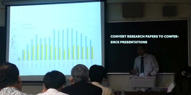
Pictures or graphics in the slides attract more attention of the audience. Thus, using more pictures and graphics is relevant in a conference presentation and it must not be overloaded with monotonous data or text. Too much text makes the slide unreadable.
2. Prepare an Agenda or Table of Contents slide.
3. Proofread everything, including visuals and numbers.
4. Font size must be large enough to be easily read. Using a variety of fonts in is distracting.
For a long presentation, changing the background designs when shifting to a new topic attracts the audience to listen. Animation effects can be interesting when used in moderation. Too much animation is distracting and time taking.
Slides must not be read aloud. Audience can read the slides themselves.
Numbers are usually confusing to the audience. They should be used as little as possible.
Charts need to be clearly labelled. Numbers in tables are both hard to see and to understand. There is usually a better way to present the numerical data than with columns and rows of numbers. PowerPoint deletes portions of charts and worksheets that are imported from Excel which is more creative.
Key points to be remembered for a conference presentation: